Jamieson Vitamins
Art Director: Samantha Gareau
Copywriter: Adam Vanderkolf
Account Manager: Danielle Brown
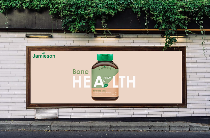
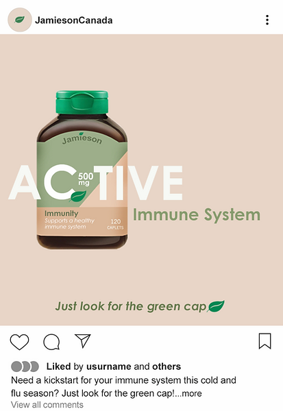
The Rebrand
In this rebrand, our goal to market Jamieson vitamins as a Health and Wellness brand with an upgraded, minimalistic design. I decided on a neutral, simplistic, colour palette and kept the iconic green cap of the bottle as well as the general layout.


This campaign highlights the various wellness benefits of taking Jamieson vitamins by linking types of vitamins with their specific health advantages through the emphasis of strategic design and copy. Millennials are a more health conscious generation than their parents, and we believe that highlighting the targeted benefits of Jamieson Vitamins will cater to the millennial mindset.
The Campaign
Our campaign includes a variety of OOH as well as digital ads, including public transit shelters, billboards, magazine advertisements, and sponsored Instagram posts.